| Who is online? | In total there is 1 user online :: 0 Registered, 0 Hidden and 1 Guest None Most users ever online was 120 on Fri Mar 26, 2021 4:07 pm |
| Statistics | We have 109 registered users
The newest registered user is saymiked@yahoo.com
Our users have posted a total of 172 messages in 76 subjects
|
| | | Our Forum Review |  |
| | | Author | Message |
|---|
Joey Wheeler
LDragon


Posts : 32
Rep : 0
Join date : 2016-04-03
 |  Subject: Our Forum Review Subject: Our Forum Review  Thu Apr 28, 2016 5:32 am Thu Apr 28, 2016 5:32 am | |
| So i decided to get our forum reviewed.
Topic: http://help.forumotion.com/t146925-death-network-academy-simple#1011292 | |
|  | | Joey Wheeler
LDragon
Posts : 32
Rep : 0
Join date : 2016-04-03
| | Subject: First Review by: Poser Thu Apr 28, 2016 5:33 am | |
|  Death Network Academy Death Network Academy | First Impressions |  |
 | General Forum Appearance |  |
| Forum Activity | |
| Staff & Usergroups | |
| Forum Originality | |
| Forum Layout & Organization | |
| Grammar & Spelling |  |
Conclusions
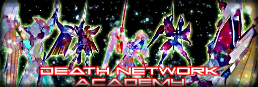
Entering your forum, I directly noticed your banner. Although I noticed it, it was not that appealing, as it feels like it is way off the totality of the forum. Some of the colors in the forum does not seem effective in capturing the attention of the viewers. I'll convey them on the next section. However, I have admired the sleek appearance of your forum, which made me impressed as I went on.
In your general forum appearance, the forum post icons are very commendable. The colors do go along with one another. However, there are two icons that I feel like they are way off (New Post and No New Post) from the other forum topic icons. I would like to suggest to recreate them, but it's up to your liking. Another is the forum background. I think its strength is the same as the categories and forums, and so with that, the floating appeal is somehow not achieved. I would suggest to make the background darker so as to achieve the aforementioned thing. Lastly, there are missing descriptive images for your category "Dorm Hall". At the time of writing, only Utopia White has that. With that, I'd wish you'd take a look in that and have it updated.
In your forum activity, it is noticeable that you have just started your forum, judging the membership date of your u1, which is dated April 3, 2016. But it is good to see that most of your members have recently visited in your forums. Though they have visited, they do not post that much. It should be taken in advantage that when they are always visiting your forum, you should provide forum games (let it be your official dueling game or just offtopic games). Provide a lot of interesting topics to discuss. Since it is a gaming forum, why not include a character creation/ card creation as part of your forum? Lastly, affiliate with the other active RPG forums. In that way, you can boost the membership in your forum. As administrators, do not be afraid to think "outside the box". Be creative! Think of something that would make your forum stand out from others.
For the staff and usergroups, their number is very reasonable. However, I'd suggest that you update your group description for each of the groups so as to inform the members about their purposes in the forums. Also, I'd suggest the change of color to the group "Admin" as it is almost unreadable. Try a lighter color.
As to your forum originality, I would say that your concept is common. Do not take it as an offensive comment, but rather, a constructive criticism, which leads me to the encouragement of letting you think of innovations that will make your forum stand out from the others. Be ambitious! Since your forum is young, I will be waiting for your updates as it really excites me to see a forum growing dramatically.
For your forum layout and organization, your layout is indeed praiseworthy. However, I'd point out the following suggestions:
1. Retention of only one of the two widgets, "Top Posters and Top posting users this month", for I think they are redundant when you'll have the two posted;
2. Reposition the category "Updates" next to either Forum Hub or Market, since updates are very important and should be seen at the top; and
3. Removal of Banned Members forum, because I think it isn't right to out emphasis on those banned members. They may be banned, but you are not there to humiliate them. I noticed that inside the mentioned forum is a topic named "Banned Membe Sheet", which I believe will be filled out by moderators. I believe it is rightful to make it only visible to your moderators or admins.
Lastly, your grammar and spelling is exceptional! No errors spotted.
Much has been said here, although this is just a simple review. Remember that the biggest room in the world is the room of improvement, so make use of that. I hope my points above will help you.
Forum Strengths
- Graphics
- Post Icons
- Number of Usergroups
- Widgets
Forum Weaknesses
- Banner
- Forum Background
- Missing Images (for Dorm Hall)
Average Review Score: 7.86
| |
| | | | Joey Wheeler
LDragon
Posts : 32
Rep : 0
Join date : 2016-04-03
| | Subject: Second Review by: Distruktion1408 Thu Apr 28, 2016 5:36 am | |
| Death Network Academy | First Impressions |  |
| General Forum Appearance | |
| Forum Activity |  |
| Staff & Usergroups |  |
| Forum Originality |  |
| Forum Layout & Organization | |
| Grammar & Spelling | |
Conclusions
- While visiting your board I was not too impressed with it, especially the banner at the very top. While it does have to do with your forum, no other banners except Utopia White were shown. The forum appearance was really slacking I would definitely contract a graphic artist to help you with that. It really looked like the original theme was not edited at all, I would like to see at least some new forum icons. The activity on your forum is okay, but it could be better. You and your staff have been posting alot, while the member base has not been, so I would review this and perhaps start some forum games. I would suggest starting some tournaments because keeping users engaged will keep members and make new people want to become members on your forum.
As for your usergroups, great job on making them. The groups are quite original and they match what your forum is all about. I did want to point out the fact that the groups "Admin" and "Event Organizers" are not too visible on the legend. This should definitely be fixed, as it gives a incomplete feeling to the board as a whole. Otherwise you seem to have the right about of staff for your activity. So, great job there!
Your forum is not too original as it follows a theme given and it looks like no time was taken to at least edit it. However, your widgets looks great. Not only that but you also have the widget called "how many visits?", I like this because it shows your site is getting viewed. Major props on this as this can also help with showing people your forum is active.
Your forums layout was superb. It was really well balanced on both sides with the widgets. It was easy to navigate to many different areas since the forum was so well organized. However, I would like to suggest for you to merge the two forums called "Test Rubric" and "Test Requests" because normally there would be only one rubric or posted updates of it. Therefore, it presents an unused forum. So, otherwise good job on that.
I did not find any spelling or grammar issues on your board. That is an awesome thing and this will become harder as you gain a higher member count. So, keep up the good work.
Forum Strengths
- Organized
- Balanced Widgets
Forum Weaknesses
- Incomplete Graphics
- Low Membership
- Inattentive Staff
Average Review Score: 6.57
| |
| | | | Sponsored content
| | Subject: Re: Our Forum Review | |
| |
| | | | | | Our Forum Review | |
|
| | Permissions in this forum: | You cannot reply to topics in this forum
| |
| |
| | How many Visits |

|
|